Monday, December 19, 2011

LATE SUMMER CLOUDS


With this small painting, I was initally attracted to the scene by the soft puff-ball clouds in the sky. Where I live on the East coast of the US, I don't see them that often so was eager to include them in this painting. The scene is near the Fraser river in Canada just south of Vancouver where I have had the pleasure of staying for some time these past few years and still have many happy menories working there. I kept the landscape relatively simple so as to keep most of the interest up in the sky area. Being one of my smaller works, I was able to complete it within a few days. Size is 8" X 10", oil on canvas.

Tuesday, November 22, 2011

GOLDEN EAGLE

Being able to draw this beautiful eagle close-up was a chance that I couldn't miss, fortunately the drawing went well right from the start as my time was limited. But all the same, it took far longer than I had anticipated and frankly was happy that I had finished this piece. I don't often do that many drawings as completed works but this one was a wonderful introduction to the character and structure of this eagle. This is the first time I have worked on this species, mainly due to the fact that I haven't seen that many of them in the wild. This bird (in a wildlife rehab center) had been injured and couldn't be released so it was the perfect opportunity to gather details that couldn't be seen in the wild. I used a few different grades of graphite pencils for this one ranging from HB to 2B. The size is 9" X 11". SOLD.

Thursday, November 3, 2011

IMMATURE BALD EAGLE, PART 3

Working on the feather tips with pale brown gouache finally brought out the beauty in this young eagles' plumage. I did have to subtly darken a few areas and if truth be told, I may stil go back and do a bit of work here and there but for now I'm calling it finished. I did alter the curve of the neck slightly and perhaps this area also needs a bit of work. Some of the finer details were added right at the end as until this point, I just trying to get accuracy in tones and chroma. Apart from the eye, nearly all these smaller details come at the very end. Working with gouache is a little easier than working with pure watercolor and for studies like this is probably the preferred way to go. I thought that this would be the last in this series but I may just take another look at the first one I did (especially since this one was a quick study) and see if I can make a little more of it. I also have access to an adult Golden Eagle in a raptor rehab center so may well go there soon and visit. This study is 8.5" X 7.5", watercolor and gouache on 100% ragboard.

Wednesday, November 2, 2011

IMMATURE BALD EAGLE, PART 2


Quite a lot of work has been completed so far and the painting is nearing the end. It didn't take me very long to get to this point but from here on the work will slow down as I tackle some of the more intricate details of the eagles' plumage. I have done very little opaque overpainting so far, instead concentrating on getting the base tones accurate. There is still some darkening to do but I'm pleased with it so far. The eye is basically complete as is the bill although there are some darker tones to be added here too along with some finer details and some modeling. Next I'll start on adding the pale tips that many of the head feathers have then finish up with the final smaller details etc.

Tuesday, November 1, 2011

IMMATURE BALD EAGLE, PART 1

Here with this the fourth in the series of young eagles, I have tried to approach this study slightly differently. Working not on watercolor paper but on ragboard, I first drew out the image of the bird as usual and decided on a side view of the head making it more of a regular portrait. This format can look a bit like an illustration if one is not careful and I was worried that this is how the painting would turn out like. Also different with this one was the use of gouache instead of the pure watercolor that I usually use. This would allow me to work on the underlying tones of the plumage without worrying about painting around all of the highlights (such as the lighter tips to most of the head feathers etc). I could then use opaque watercolor later on to paint in the feather highlights. As it turned out, there would be a lot less of that than I had thought. Being somewhat set in my ways, I still painted around most of the lighter tones that I had initially laid down and you can see from the above image that this painting was still built up with thin washes as in most of my usual watercolors. I worked on the eye almost to completion then set the work aside until the next session.

Monday, October 31, 2011

YOUNG EAGLE, PART 3

Here is the finished painting. Mostly it was a case of laying in more washes of watercolor building up tones and adding detail. I was careful no to go too dark with the plumage remembering the lessons learnt in the first of this series and in doing so retained a feeling of bright sunlight on the bird. The shadow under the beak that continues down the breast helps immensely here. So far I feel that this one is the most successful of the three and for the next one, I'm planning on doing something slightly different.
There is some difference in the color balance of this image in regards to the two previous posts probably because I photographed those stages outside while this one was done inside using photoflood lamps. The watercolor of this young Bald Eagle is 9" X 7.5".

Saturday, October 29, 2011

YOUNG EAGLE, PART 2

Here there is not that much difference from the last image posted but I have finished the eye and also worked on some of the smaller feathers around the cheek and crown. The beak has also some thin washes added to help define the shape and structure. Actually at this point I am moving along quite quickly and this is probably due to the fact that I have already completed two other studies so far. I feel that this one will come to completion quite soon (hopefully tomorrow) and I'll then be able to get onto the fourth and final work in this series of young Bald eagles. As a side note, the painting so far reminds me of a Golden Eagle which has a slightly more 'open' face look to it and consequently tends to look a little more friendly than many of the other large eagles.

Friday, October 28, 2011

YOUNG EAGLE, PART 1


Here we go with the third in this series. I wanted a slightly more relaxed effect with this painting so chose to pose the eagle with a little more light on the side of the head and with less in the way of deeper tones. Both of the earlier studies were of a young eagle looking quite intense. Time for something slightly different. Starting in my usual way with a careful drawing, I laid in a background wash all over the paper then some warmer brown tones to the plumage before letting it dry. When I came back to the painting, I worked for some time on the eye aiming for life and accuracy. I have found that if I don't get it right at this stage, I may as well kiss the painting goodbye. If this does happen, I'll just select another piece of watercolor paper then simply start again. Fortunately everything went well with this one so after a few lighter washes of Cadmium Yellow around the eye and beak, I mixed up a weak mixture of Cerulean Blue slightly greyed with Burnt Umber then applied it carefully to the bill. The shadow under the chin was the same mix but greyed even further. Next I'll finish the eye then work on getting some darker tones to the head and nape feathers.

Thursday, October 27, 2011

BALD EAGLE, PART 3

Working mostly on the plumage along with a few finer details added here and there has brought me to this point. It has taken me some time but I managed to get the feeling I wanted with this painting. As with most of my watercolors, I built up the tones by adding thin washes of color being careful to paint around the lighter areas. This is a sub-adult eagle, probably about two years old. The bill and the cere has started to lighten but the iris is still dark - this will gradually lighten over the years until the bird becomes an adult in about 4-5 years. Although I do like the white head and tail of a mature Bald Eagle, my artists' heart prefers the plumage of an immature and I find working on such a bird far more stimulating. In the early stages of this work I was continually reminded of a young White-tailed Eagle of Northern Europe and Asia - although that bird has an even more massive bill! I still hope to see and paint that eagle one of these days and greatly admire the work of Lars Jonsson who has done many paintings of these magnificent birds. This study is 9.5" X 7.5".

Wednesday, October 26, 2011

BALD EAGLE, PART 2


With this new painting on its way, I begin to feel confident that something will come of it. Since I chose a more up-right pose, my intentions are to capture something of the character of this young eagle along with a hopefully meaningful interpretation. Most of the head feathers of young or sub-adult eagles are tipped with pale spots so in order to capture this in my painting, I had to paint around all of these tips leaving the underlying washes to somehow represent them. This seemed a very difficult task so work proceeded slowly. I could have masked off all of them using masking fluid but I really don't like doing this and seldom resort to masking in any way. Once I had laid in more of the base colors and tones, I spent quite a bit of time working on the eye again bringing it close to being finished. The bill also received some work keeping the washes light for now as I wanted to retain the effect of bright sunlight which I felt I lost a little on the previous eagle painting.

Tuesday, October 25, 2011

BALD EAGLE, PART 1

Now that the previous eagle study is out of the way, I feel a little more confident to start a larger piece. I'll be taking a lot more time with this one as the first study was really just a way to get back into doing this kind of thing. I have found that I sometimes need to do it this way especially if I haven't painted a watercolor study for some time. As usual I started with a careful drawing all the while trying to be as accurate as possible. I wanted something with the bird looking slightly away this time. Working on un-stretched hot-pressed Arches watercolor paper, I laid in a warmish grey wash over the whole sheet then when it was dry started on the birds eye and bill. A warmer brown was then washed over the top of the head and breast. Slowly building up a series of thin washes around the ere and bill brought me to the stage you see above. The painting still has a long way to go but so far, I'm happy with the start.

Saturday, October 22, 2011

YOUNG BALD EAGLE, PART 4

To cut down on the contrast between the bird and the background, I laid in a thin wash of warmish grey all around the image which doesn't show that well in the photo. Also there are some strange marks in the background that aren't there in the actual painting either - most strange! I tried deleting and up-loading the image a few times but each time was the same - really weird as this hasn't happened to me before (fortunately all this disappears when you click on the image).
Anyway, feeling better about the contrast, I worked a little more on the feathers of the cheek, throat and nape. Mostly this consisted of darkening them and adding a little definition here and there. The bill was darkened also and the brownish areas on top of the head were adjusted to be a little more on the ochre side. I do feel however that something was lost in the last step, mainly the sense of bright sunlight on the bird and consequently a slightly washed-out look. I could have countered this by deepening the shadow areas but as this portrait is really only a work-up to the coming studies, I left it as it was - I'll remember this for the next one. Also I didn't take as much time with this study as I usually do for two reasons; one, it is a smaller work and two, I wanted this one to be a little more like a watercolor sketch. At the time of writing this, I have already started on the next eagle painting and it will appear here soon. This watercolor is 6.5" X 5".


Friday, October 21, 2011

YOUNG BALD EAGLE, PART 3

There is quite a big difference between this stage of the painting and the last one. This is mostly due to the darker tones that I laid over the base color washes. At this point I'm trying to accurately depict the plumage without overdoing it. I usually build up the darker tones by adding successive layers of color until I feel that I am getting close to where I want to be. Often this is done without looking at my references as every painting demands something different. I'm also trying to get a balance between accuracy and an interesting interpretation. Just stating the facts usually leaves me a little unsatisfied and I'm always working to get a little more into each painting. Continuing this way allows me to build up the work into something I want instead of just putting down what I see in front of me. At this stage with most of the darker tones added, the bird is beginning to look a little stark against the background so I'll address that in the next part.

Thursday, October 20, 2011

YOUNG BALD EAGLE, PART 2

Here I have laid down a few more washes trying to modulate the form a little and also indicating the shadow of the beak. More color has been applied to the eyes and surrounding areas as well as some cad yellow to the gape. I mixed cerulean blue with a little burnt umber to grey it slightly then applied that to sides of the beak trying to be careful not to go too dark. A slightly darker brown brought in a little more detail to the eyes and under the chin. Letting this dry off, I came back ready to add some details and get the darker tones of the plumage in place. It's all looking a little wishy-washy at the moment but I realise that all paintings go through stages like this so I don't let it bother me too much. I'm keeping my eye on the final image which I hold in my head all the while I am painting. Next - big changes when I lay in the brownish-black tones of the head and get to some of those wonderful details.

YOUNG BALD EAGLE, PART 1


This series of young Bald Eagle paintings all started some time ago when I was in Florida and happened across an immature Eagle. At the time I only had a ballpoint pen at my disposal so after grabbing a sheet of regular paper (from where I cannot recall) I quickly drew the head trying all the while to capture the essence of the bird. More sketches followed and later this was pasted into one of my regular sketchbooks. The head sketch appears above followed by the initial stage of a small watercolor. I decided on a head-on pose as I wanted to capture the penetrating gaze that I felt whenever this eagle looked directly at me. After a quick drawing, I washed in some raw-sienna followed by burnt umber for the eyes. A little cerulean blue did for the soft part around the eye on the right then I let things dry off. Next I'll work a bit more on the underlying washes which are often so important for a watercolor.

Friday, October 14, 2011

FIRST LIGHT - WESTRIDGE FARM

With this small painting I tried to capture the beginning of a new day. Both the dawn and dusk landscape are important times for me as an artist as I seem to respond to the landscape with a greater sense of depth and meaning during these times than at any other. I'm still working hard trying to capture exactly how I truly feel when out painting and transferring all this into my work. I'll be out a lot more now that it is a bit cooler as the fall always has some of the most spectacular skies of any season. This oil is 9" X 12".

Tuesday, September 27, 2011

YOUNG EAGLE

I saw this young Bald eagle at a wildlife art exhibition that I took part in a few years ago. Bring as it was from a rehab center, I found the bird to be quite relaxed around people and managed quite a few sketches along with some photos and various color notes in my notebook etc. When I got back to the studio, I decided to create a portrait of the bird in oils instead of the usual watercolors that I had been using for these kinds of things before. So working on a board that I had given a few coats of gesso, I rubbed in a yellowish-brown color for the background and when it was dry carefully drew in the bird. The plumage was then laid in on layers waiting until the underlying one was dry before adding the next although the large beak was done in one sitting. Most of the long head plumes were tipped with a pale cream creating a beautiful look so these were carefully added last - all this is lost when the bird matures though. I spent quite a bit of time working on the eye being careful to get it right in the hope of bringing the bird 'alive'. In the end I was pleased with most of the portrait but plan on doing another one of these days. Young Eagle is 12" X 9". SOLD.

Wednesday, September 21, 2011

MORNING IN ANZA BORREGO


They say that time flies when you are having fun............... well I must be having a lot of it since I can't believe it has been so long since I last posted on my blog!
Morning in Anza Borrego is an older painting done from a trip to the South-western US desert some time ago. Mornings in the desert are always special and on occasion, one is greeted with a wonderful cloud formation. That was the idea with this painting and I worked on a 16" X 24" canvas in oils laying in the graduated blue sky first before adding the clouds a little later. The landscape was purposely kept subdued so as to focus the eye on the sky so I used harmonious pastel shades echoed in the sky. I love the small 'popcorn' clouds which are not seen that often and have always found the sky to be a great teacher. It is never the same and I am always surprised and delighted. Evening walks are always a joy as they are timed to coincide with the setting sun. At this time of the year birds fill the sky at this time too so it is an irresistible combination.

Thursday, July 21, 2011

EARLY MARCH

I have been working on some larger paintings over the past few months and they have been taking longer than anticipated. This is the main reason for the dearth in posts lately, hopefully I'll have the latest works finished soon! In the meantime, this small oil was completed some time ago as shows the snow and ice looking south over a small stand of trees in Blackwater. I remember it being particularly cold that day with a bitter wind and many longings for spring! The clouds were kept simple and represent the sky when snow flurries are usually present but a little light in the frozen middle ground indicates that there is the occasional ray of sun breaking through.... Early March is an 8" X 10", oil on canvas.

Friday, June 10, 2011

EVENING SKY STUDY

There haven't been any recent posts because I have been away for awhile in Canada exploring, bird watching and painting the landscape. I did this quick study (and a few others) when I got back to the studio in preparation for a large work - actually just playing with ideas in paint. I usually keep them small and simple, sometimes doing a series of them trying different color combinations along with cloud formations. I'll hopefully finish the larger one soon along with a few others that I'm currently working on. This oil is 4" X 6".

Wednesday, May 18, 2011

ALONG THE COAST, PART 5

The foreground water and rocks have been added bringing most of the painting to completion. I have darkened the main area of rocks slightly and lightened the longer rock just under the breaking wave as I felt that it attracted too much interest being as it was right next to the lightest lights in the painting. I'll probably frame it next then see how it looks in that before adding the final details. That will have to wait for a bit until I take care of a larger commission first - more on that painting later. Suffice to say that I have done a few smaller studies and those have worked out well so let's hope that the larger painting will too!

Monday, May 16, 2011

ALONG THE COAST, PART4

Making further progress on the rocks, I used a combination of yellow ochre, raw umber and burnt sienna lightened with titanium white. Generally I brush in a mid-tone then add darker areas such as the deeper cracks etc then use a stippling motion of the brush to create texture and variation amongst the rocks. Sometimes when a section has dried, I'll glaze a slightly darker color over some areas to adjust tones and create depth. So far I feel that the rocks are a little light in overall tone so I'm sure that I'll have a bit of glazing to do later on. Next session should see this one finished although I'll probably live with it for a few days to see if there is anything else needed.

Saturday, May 14, 2011

ALONG THE COAST, PART 3

Here I have completed most of the upper rocks. At this point in the painting process, I'm not too worried about the exact tones of the rocks as I'll have to see how it all looks when I get closer to finishing the work. If necessary, I'll lighten or darken them when I have completed the water in the foreground as this will be the last of the white areas left on the canvas. I suppose I could tone the whole canvas right from the start but I have never really liked doing this and feel that it's better to stick with what comes most natural to me. While the most recent work is drying, I turn my attention to the water adding some more white to the top of the breaking wave and also to some of the larger waves in the background but being careful not to overdo it. Tomorrow I'll finish the lower rocks then work on the foreground.

Friday, May 13, 2011

ALONG THE COAST, PART 2

I started with the sky laying in some light blue-grey oils across the top then darkening and shaping the distant clouds near the horizon line. These were blended in until I had the softened atmosphere that I wanted then a lighter mix of the same color was brushed into the sea. Waves were added with a darker mix and I carefully worked in the breaking wave and foam near the left-hand rocks. Then when I was happy with everything, I added the rocks themselves using raw umber, a touch of burnt umber and titanium white. With what I felt were the correct tones in place, I left everything until the next day when I would have a go at the rocks along the shore.

ALONG THE COAST, PART 1

I realised that I hadn't shown an in-progress painting for some time although I did plan on doing so with the Tool Shed watercolor painting a few blogs ago - somehow I forgot so here is the latest. At first I had planned on doing a small study but couldn't find the right sized canvas in my studio. So instead of going through all the rigmarole of cutting one to size, I grabbed a larger 16" X 20" canvas and just used the top section (I'll make a stretcher for it later and mount it when the painting is finished and has dried off properly). Using a wash of thinned raw umber, I drew in the rocks and horizon line aiming for accuracy but not worrying too much about it all. That is the beauty of working in oils, one can so easily rearrange and true up things as one goes along! Satisfied that all was where I wanted it, I left the canvas to dry off for awhile. Next, getting some serious painting going!

Monday, May 2, 2011

SEA EAGLE NEAR SAI KUNG

Since moving to the US quite a few years ago I have fortunately had the opportunity to travel back to Hong Kong quite often. I still think of the place as my old stomping ground and miss almost everything about it! And sometimes being in the right place at the right time is just the ticket. I happened to be in Hong Kong when with great excitement in the birding community there, an immature White-billed Diver (Loon) was mentioned as being seen just off the coast of Sai Kung in Eastern Hong Kong. The next morning 30 or so birders and photographers assembled at a pier to board a rented boat especially for the purpose of sailing out and seeing if the bird was still in the area - luckily for us it was! An amazing bird and was watched for almost an hour mostly between dives. Many photos were taken, descriptions of the bird were noted and I managed a few sketches - not easy in a pitching boat looking through binoculars! I still have to paint the bird seen that day and plan on getting to it soon. I believe this was just the third record for White-billed Diver in China at the time so it was a major tick! While returning back to the pier, I saw a White-breasted Sea Eagle nearby and did a small painting of it later on. Approximately 10 pairs breed in and around Hong Kong and they are always a welcome sight when I return. In the painting, I kept the bird small as I wanted to record the area and the atmosphere of that particular day more than anything. The watercolor is 5.5" X 7.5".

Tuesday, April 26, 2011

EAGLE NEAR HAZELHURST

One of the joys that we as artists experience is getting a chance to exhibit with others and for me, the most exciting one is at Birds in Art held annually at the Leigh Yawkey Woodson Art Museum in Wisconsin, USA. Over the weekend various events are arranged and taking the bus up to Hazelhurst is always special. There at the country house, one is free to relax, swim, walk the grounds or take a boat ride on the lake. Loons are common here (excuse the pun) along with other birds and occasionally one is lucky with the sight of an eagle. The bird in this watercolor is heading across the lake under a somewhat moody sky. I tried to be a little looser in my washes with this work and it seemed to work especially in the water which I'm quite pleased with. Eagle Near Hazelhurst is 5.5" X 10".

Sunday, April 17, 2011

THE TOOL SHED

This is another painting in the Grit and Glory exhibition starting this weekend at McBride Gallery. I initially became interested by the light and shadows cast inside this shed by the gap at the top of the door. Also the way that strong abstract shapes were created amongst the tools stacked on the right. The weathered boards inside were quite deep in tone at the top but faded considerably near the floor. I noted an ancient push-mower inside along with a few scythes and other oddments - all fascinating to me with their patinaed finishes suggesting old age and much hard work. The exterior had a well-faded and damaged look that spoke of many hot storm-drenched summers and equally freezing winters - I had a lot of fun painting this one! The Tool Shed is 22" X 15", watercolor on Arches paper.

Saturday, April 16, 2011

THE TRACTOR BARN

I did this painting for the up-coming Grit & Glory exhibition that starts this Sunday at McBride Gallery in Annapolis, MD. In this scene I was at first taken by the strong sunlight and how it made interesting shadows on the floor of the barn. The two forward support posts were in part sun - part shade and I saw a recurring theme in the angled forms running from left to right. Later I became interested in the old tarps hanging between two of the support posts on the right so these were carefully painted in taking care not to make them too prominent. The back wall of the barn has all sorts of things including stacked wood and an old ladder etc but I left out some of the junk that was lying about. I tried to get a weather-beaten feel to the scene using drybrush and slowly building up tones with many washes of color. I love scenes like this as they often remind me of my childhood experiences living on a farm in the South of England.
Grit and Glory runs from April 17th to May 8th, so if you are in the area I hope you'll stop by and take a look. The Tractor Barn is 11" X 22".

Thursday, April 7, 2011

LAKESIDE STUDY

A few weeks ago, I was mentioning to Pat in the comments section of this blog about how the painting of the hunting Barn Owl came about. There had been a study completed which was quite a bit different from the finished painting so have decided to post it here. Initially completed in my sketchbook, it was supposed to be the basis for a larger watercolor painting but things didn't go the way that I had hoped. The scene is nearby in the nature reserve where I often go and paint so I know it well and should have been a simple case of creating the painting using this study as I so often do. I'm not quite sure why the final work was so different but it seemed to take on a life of its own. As an artist, I often struggle with this so I am in some ways used to it. I think the lesson here is that creating art is never a formula and one takes from it what one can. I try to do things in a new way as I see them even though I am can be influenced by others. Really all it comes down to is that I want to create my own message and tell things in a way that is important to me - probably why I spend so much time painting plein air. Lakeside study is 7" X 4".

Thursday, March 31, 2011

GYRFALCON

This, the largest of the falcons has long been my favorite raptor. I am fortunate to have seen this bird in the wild but most of my paintings have been done from birds either as used in falconry or in captivity. One of these days I'll go North to see them proper but until then I will enjoy drawing and painting this amazing bird as the need arises. Here in this painting I concentrated on just the head but in actuality, the rest of the bird is equally impressive with wonderful pale feather fringes and an intricate wing and back pattern. The feet (and other bare parts) were a pale bluish-white and the iris, a dark brown. I still have to paint the white Gyrfalcon - probably the most impressive of the different races but that will have to wait until I come across one! As is with most of my paintings, I started with the eye and the faint reflection before working out from there. I feel that if I can get the eye right, then the rest of the painting usually follows along nicely. This watercolor is 11" X 7.5". SOLD

Friday, March 25, 2011

RESTING ROYALS


These royal terns were part of a larger group and were resting on a beach in Florida last February. Being Florida, it was supposed to be warm but was actually unusually cold and windy! Still a wonderful time was had as we strolled along the beach taking in the fresh air and the movement of so many birds. My sketchbook from that time has other tern studies seen that day along with some resting ring-billed and laughing gulls. A brown pelican stood in the shallows along with feeding great-black backed and ring-billed gulls while Northern gannets soared in the stiff breeze offshore. Sanderling were active along the shoreline along with a few willet and I spotted a possible brown booby way out but it was too far away to be sure.
The painting of these terns took a few months to complete as I couldn't quite resolve the foreground so hesitated for some time. Finally I completed it this week. These royals shown here are still in their winter plumage and will in a month or so obtain a fully black cap looking then quite spectacular! Terns of all species have a special significance to me and I love the old English name for them - sea swallows. Within the genus, the Caspian tern is probably my favorite. It wins on sheer size alone but I also love the large bright-red bill. As with other large birds, I often see something of myself in them when viewing them through my spotting scope.
Update! When I posted this painting a few weeks ago, I realized that I hadn't taken such a good photo of it and the image had too much contrast. In the interim, I have also done a bit more work to it and have since re-photographed the finished version. Now I'm a little happier with it. Resting Royals is 9" X 14.5".

Wednesday, March 16, 2011

HUNTING BARN OWL

I started this watercolor painting near the end of last year but only finished it this week! As is usual for me, I began with sketches and a small pre-study in my sketchbook. Everything went well in the planning stage, I was happy with the colors and composition and couldn't wait to start the actual painting. After stretching a smooth piece of (hot-pressed) Arches watercolor paper onto a board, I laid in the first of many background washes. Then after adding the grasses and trees, things began to go astray and the work got further and further away from my initial idea. I'm not sure why this happened but simply following along with the process usually brings about resolution with the work. In this case, it was simply spending enough time with the painting propped up in my lounge so that I could see where to go with it next. There was more to the work at the bottom that I simply cropped away and this did help somewhat. After I had completed the landscape, I made a small cut-out of a barn owl in flight then moved it around the painting until I found what was for me the most pleasing position then it was painting in. Hunting barn owl is 7" X 7".

Thursday, March 10, 2011

BONELLI'S EAGLE


This is the second in the eagles in flight series - this time featuring an adult Bonelli's Eagle. When I first moved to Hong Kong, I lived in Kowloon for awhile and when I got tired of the noise and hustle-bustle of so many people, decided to look for a quieter place to live. Someone I met in a Chinese restaurant suggested visiting one of the outlying islands - as it turned out this was very fortuitous meeting. I happened to end up at the Lamma Island ferry pier in Central Hong Kong and when the ferry arrived boarded for the 40min or so trip out to the island. Lamma is the 3rd largest island in Hong Kong and the closer I got to it, the more sure I was that this is where I wanted to live. And as I first set foot on the island, a stillness and peace came over me unlike any I had felt before. Lamma back in the 80's was quite rural by Hong Kong standards with vegetable and pig farming being the usual, although the making of shrimp paste close to the pier was an unforgettable and incredibly smelly experience - but the less said about that the better! I eventually found a flat next to a quiet beach and was further delighted by discovering a resident pair of Bonelli's Eagles that nested on Mt Stenhouse (situated on the southern end of the island). I quickly found my way up there looking for the nest (unsuccessfully) but often saw the eagles as they soared past my balcony to and from the island. So in many ways, this painting is a tribute to that time and is just as I remember them. Usually they were seen in a pair but for this smaller work I just wanted the single bird. I'll probably do the pair later on and I also want to do a painting of the immature which has a lovely warm buff underparts. This watercolor is 10" X 7.5".

Friday, March 4, 2011

SPOTTED EAGLE

In an earlier post I mentioned that I was working on a series of birds in flight and my sketchbooks are slowly filling up with studies and sketches of birds as I work towards this goal. All this of course is leading me somewhere and that is to... Eagles! A most magnificent family of birds and until one has seen an eagle in flight, it is difficult to really comprehend the incredible presence they have. I have been fortunate to see many different species all over the world and hope to show some of the studies and paintings of them here. The first in this series is shown above.
The Greater Spotted Eagle winters as far south as South China and I saw this adult in Hong Kong. Usually one doesn't associate these large raptors with all the food, shopping and skyscrapers that has made Hong Kong such a popular destination but in the north near the Chinese border is Mai Po - an internationally recognised and critically important nature reserve. With the congregation of so many waders, ducks and other waterbirds, it is not unusual to see raptors of all kinds hunting there. Spotted eagles are a regular winter visitor to the region and the adults are relatively unmarked looking simply dark from underneath especially in strong sunlight. Which begs the question - why then are they called spotted eagles? Well the name quite accurately describes the juveniles which have bold whitish markings mostly on their wings and back.
I did this study first in a way of easing into painting larger birds in flight and unfortunately choose an impossibly smooth piece of illustration board to work on. This didn't take repeated washes well - I could have airbrushed the sky I suppose but since I never do this I decided to stick with what I had started with. The bird was painted in once the sky had dried being careful to keep the lighter areas to the primaries and under-tail coverts. Spotted eagles can look a little rough - that is to say that their flight feathers are seldom regular and I have heard them described as a 'ragged mat in the sky' which quite adequately sums them up! For my painting though, I cleaned this one up a bit and finished it off by layering on many thin washes of mostly sepia and burnt umber until I had reached the darkened tones I wanted. This watercolor is 9" X 7".

PHEASANTS IN SNOW

Keeping with the snow and winter theme of the past few posts, I wanted to show this painting that I completed some time ago. Although pheasants are not that often seen around here, I know them well from the UK and more recently saw them out on the Eastern Shore. For this painting, I wanted a typically heavy snowfall scene where pine branches had been pulled down by the weight of the snow forming a sort of cover for birds and animals. The perfect place to find pheasants in fact! I started the painting working from the background forward then put in the pheasants before finishing the snow-laden branches and foreground. I kept the snow colors quite neutral so that the pheasants would be the only spots of warmth in the painting. I enjoyed working on this one and have something like it planned for a new work in the future. Size is 24" X 36" - oil on canvas. SOLD.

Thursday, March 3, 2011

FROZEN LAKE - STUDY


Another small winter painting. I was supposed to get all these studies posted here last month when I had painted them but didn't get the chance until now. Again, another scene from the reserve near our home looking across the lower lake to where the feeder stream runs in. It's getting later in the day here with the evenings coming on early in winter. A thin layer of snow has fallen on top of the ice but there has been some melting along the edges creating a break between the lake and the land. Just to the left and out of the picture is an active beaver lodge and the water there is shallower and never freezes. Mallards congregate there even on the coldest of days and are a welcome sight in what is usually a somewhat bleak and lifeless landscape. In the painting, I kept the distant trees softer in the hopes of getting some depth into the scene and the sky is just now beginning to take on those lovely evening colors that often fade so quickly. Quite a few paintings have been done around this lake and is one of my favorite sites to go out and paint - I'll post some of the others later on. Frozen Lake is an oil on canvas, 5" X 7" - $150 which includes shipping within the US.

Wednesday, March 2, 2011

MISTY MORNING - STUDY

Towards the end of last year, I travelled down to the Eastern Shore staying with friends just outside Easton. The mornings especially were glorious - some bright, others foggy like in this painting. Here I'm looking across a small inlet over to the Miles river beyond. Sun is just above the horizon (not that you could tell!) and the sounds of geese and ducks are filtering softly through the mist - a wonderful and ethereal morning. I did this study (and a few others) with the hope of someday doing a larger version - probably with an eagle appearing out of the mist and making its way downstream. Size is 5" X 7" - oil on board. $150 inc shipping within the US.

Monday, February 28, 2011

COLD MORNING - STUDY

I completed this study during the middle of winter, which over here has been particularly severe! The idea was the show the cold winter landscape contrasting with some of the warmer grasses which in the reserve nearby take on a lovely golden color at the end of the year. Light snow aids as something of a contrast to the grasses and the darkening sky is perhaps a sign of more cold weather to come. Of course now it is almost spring and I for one are more than happy about that! There are American Robins patrolling my lawn and woodpeckers drumming in the woods. The first snowdrops have flowered and I can see the beginnings of many daffs and tulips poking through the mulch around my home. Can't wait to see the flowers!
Cold Morning study is 5" X 7" - oil on canvas. $150 unframed, $180 framed inc shipping within the USA.

Saturday, February 26, 2011

COMMON BUZZARD- UK

This painting is the second in the series of flying birds in a landscape. The scene here is on the outskirts of Bude in Cornwall where I was brought up. Looking up the valley between the river and the canal, we can see the sun breaking through a misty sky and gently lighting up the distant hills leading up to the moors. I had spent a lot of time here as a boy looking for birds and rowing the canal in a rented boat. Buzzards were often seen and I also found a nest. Checking back through the breeding season, I watched as the eggs were laid and brooded, (later one disappeared - perhaps taken by an egg collector) then the chick hatched, fledged then finally left the nest. All in all quite a wonderful experience!
After doing an earlier painting of the same valley, I did this one slightly differently and kept the bird small as this is so often the way that you see birds (especially birds of prey as they have been so heavily persecuted in the past and so are wary). The field was built up with many washes of color alternating mostly between yellow and green. I also wanted some similarities between this painting and the earlier Rough-legged Buzzard in Minnesota that was in my last post - both show the landscape in early winter but in the south of England as shown here, the weather is so much milder and grass is still green at this time. Both painting show similar birds at home in the landscape they occupy and it is interesting how when travelling all over the world like I do, that I find so often these self same similarities. The watercolor is 7.5" X 11". SOLD.

Thursday, February 24, 2011

ROUGH-LEGGED BUZZARD - MN

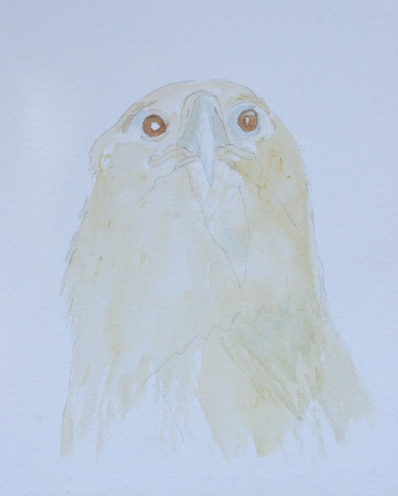
A few years ago I went to Minnesota in the hope of seeing Rough-legged Buzzards and Golden Eagles - both of which had escaped me for years. Fortunately I was able to add them to my life list and now feel free to paint them in any way I wish. The adult Rough-legged seen here was just a bird in a landscape as I didn't have my scope with me at the time so it simply became a passing moment in time. Still it was a significant one all the same and this is what I tried to capture in this painting. The time is early winter with snow already on the ground and another snow cloud just beginning to drop moisture heading in from the right. At this point it is just verga but this will be the first of many snowstorms of what is normally a long and hard winter.
Birds in flight are the hardest to do well and there are not many artist in the past who have done it. Thornburn was a typical example, as although his perched birds are quite fabulous, the ones he did in flight just don't look quite right. George Lodge was better but still not quite there. My favorite has to be Bruno Liljefors with Lars Jonsson a close second. Liljefors' eagles in flight are masterpieces with all the careful observation of not only the correct details but more importantly, the correct wing and body positions. I have long been an admirer of his and Lars Jonsson paintings who has also done some amazing work - a quick look through his 'Birds of Europe' field guide (especially the raptors section) - shows equally careful observation with completely natural looking birds in flight. So much so in fact that when I am looking at flying raptors myself, I am often reminded of him!
Now a days we have the benefit of high-speed photography which does help a lot in creating paintings but I have still seen some very strange poses! Really there is no better way than just getting out there and observing birds in their natural surroundings. I find it helpful to follow the bird through my binoculars then put down my impressions from memory. Often a certain pose will stick in my mind and that's the one I'll try and develop to a finished drawing. At this point, I'm not worried about details as photos can usually help with that, I'm just trying to get down the most accurate drawings that I can. To this end, I have started a series of birds in flight in the hope of reaching two goals; 1, getting better at painting flying birds and 2, creating some different and hopefully more interesting paintings. This most recent watercolor is 7.5" X 11". SOLD.

Monday, February 14, 2011

ASIAN PEAR


I found this Asian pear at a local Asian market and liked its slightly odd shape. So I bought it (and a few others) then took them home to paint. Oil or watercolor??? Hmm....... In the end, I decided to do it in watercolor using smooth Arches paper as a support. With a careful under drawing pencilled in, I laid on some warm background washes first then when that had dried started on the pear. I used mostly lemon yellow plus raw and burnt sienna slowly building up the correct depth of color. It took some time to get the true colors and tones (especially the shadow area) but eventually it was done. After some thought I decided to leave it just as it was - a simple representation of a delicious fruit. Size is 7.5" X 11".

Friday, January 28, 2011

NENE

I found this Nene (or Hawaiian Goose) at the Washington DC Zoo and was captivated by it's interesting plumage. Broad feather fringes on the wings and back were reverse-patterned on its breast and flanks with soft warm tones on the head and neck contrasting sharply against the dark head. I liked the way that when the bird tucked it's bill into the scapulars, gaps opened up on the neck feathers creating interesting patterns so that is how I painted it. Most zoo animals and birds are quite approachable which is perfect for sketching, drawing and getting up close to view those oh-so-elusive details that can be hard to see in the wild. Because this bird was so tame, I initially spent quite some time doing accurate drawings before starting the watercolor, which was done in many thin washes of color onto smooth Arches paper. Completed some time ago, this painting is now in the private collection of a friend. The size is 7 1/2" X 11".

Tuesday, January 18, 2011

AFRICAN FISH EAGLE

In a previous post I wrote about the beauty of the African Fish Eagle along with some studies that I have made of them. In this painting, I decided to feature the bird in its environment - here sitting in an ubiquitous thorn tree with weaver bird nests in the background. I love all birds but find that it is often the largest eagles and falcons that excite me the most as an artist and naturalist, but these birds are often the ones that are most difficult to see - at least not well enough to get enough information to create a painting. Visiting certain Zoos and wildlife rehab centers is always a good idea as is going to falconry meets etc but there is nothing like seeing the bird in the wild doing what it should. And that is what I have tried to capture in this painting. Thanks to Craig for help with this one! Size is 22" X 15" painted on Arches watercolor paper. SOLD.

Monday, January 3, 2011

THE FOREST FLOOR

I did this watercolor some time ago but only today came across a digitalized pic of it! I remember at that time quite a few years ago being struck by how much goes unseen under our feet! And as a result started to look a little more carefully - a practice that I still continue to this day. I did a series of paintings like this one and would have done more but for the fact that each one took ages! Here it is Springtime in the forest which is slowly coming to life. New plants and flowers are blooming under the dappled shade of a warm day and moss is starting to grow again after early spring showers. Last years leaves are still to be found though slowly decaying into humus. It is the time for spring migrants to be heard calling through the woods and if you are lucky, the sight of a newly-born fawn. The Forest Floor is 11" X 15". SOLD.

Saturday, January 1, 2011

BOX AND FIGURINE

First I would like to wish you all a wonderful New Year - may it bring you all peace, health and happiness! Like so many I have made a list of new year's resolutions, let's see how long I can keep to them!
I have had the box featured in this painting with me for some time, the penguin figurine for less so but I thought that they would work well together. So after trying a few different compositions, I came up with the one I liked best then made a careful drawing onto hot-pressed Arches watercolor paper. After stretching, the paper was washed over a few times with Raw Sienna then I began work on the box. More (but slightly darker) washes of the background color were added then I did the wood grain before touching in most of the smaller details with a finer brush. The figuring actually took much longer that I had thought as there was some careful modulating to see to then the darker tones were built up over time. Finally the eye of the penguin and the shadows were built up. Sometimes the simplest compositions are the best and I had in mind the work of Alan Magee while I was working on this one. Size is 10" X 12".