Friday, December 24, 2010

SUNDOWN AT BLACKWATER STUDY

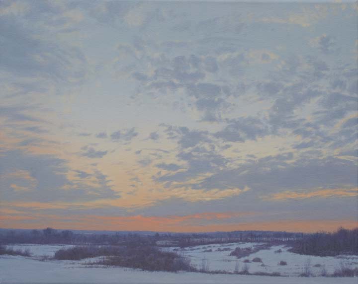
After taking a break for awhile I'm now back in the studio working on smaller studies. This was one of the paintings that sold at the Waterfowl Festival last month and most of the newer studies will be similar in size and scope. I have been out doing quite a bit of walking too (in spite of the cold weather) and have quite a few places in mind that I want to go back to and paint. It has snowed a few times already so that has been an added bonus as snow is one of my favorite things to paint. I have though, to be somewhat careful not to repeat myself as I am often attracted back time and time again to similar scenes. To help offset this, I am trying to see things from a different perspective and spending more time just walking around and looking. Dried grasses, fallen trees, soggy ditches etc all look so different covered in a layer of freshly fallen snow and I'm trying all the while to fine an unusual view that will inspire me to make a painting. This is one of the reasons that I make so many smaller studies as I find for me that this is the best way to consolidate some of my ideas. Sundown at Blackwater is 5" X 7", oil on canvas.

Tuesday, November 30, 2010

FOX TRACKS

I did this study mostly in the field but finished some of the details in my studio (where it was much warmer). I love painting snow (and skies) and look forward to winter for this reason alone. It's always a bit of a catch 22 with me though for although one of the great delights in winter is tromping through new snow, I don't particularly like the cold. Still, I do try and get out as often as possible both with my paintbox and my camera.
In this painting I tried for a zig-zag format to lead your eye into the work and kept most of the warmer grasses to the back. The small sparrow on the right is a Chipping Sparrow, most of which have flown to southern climes by the time of any early snow but there are occasionally stragglers still around. I'll probably do a larger version soon but this oil is just 8" X 10".

AFRICAN FISH EAGLE STUDY

This small study was just another way for me to get to know a little more about this magnificent eagle. I have done quite a few drawings and watercolor studies of these birds both in the zoo and at home in my studio in the hope of one day doing a larger more finished work. The sight of one (or more commonly a pair) of these eagles perched in a dead tree alongside a river or lake is one of the most inspiring sights that Africa has to offer. This watercolor is 5" X 7".


Thursday, November 25, 2010

BALD EAGLE STUDY

Some time ago I managed a close-up encounter with this eagle at a wildlife rehab center. It was a wonderful chance to observe the beauty of Bald eagles in a way that was exciting as well as inspiring. While most of my quick sketches were done to try and capture the shape and structure, some photos also helped with the details. I usually try and get as much info in my sketchbooks as possible either in the form of sketches/drawings and/or watercolor studies. When I completed this head study, I incorporated all those into this painting. Most important was the eye so careful painting was required as I wanted to be as accurate as possible as well as trying to capture the life of the bird. In full sunlight, the head glowed wonderfully especially against the darker plumage of its body and the bright yellow of the beak. I have seen many eagles in my travels around the US but none has made quite the impact that this one did. Bald Eagle Study is about 5" square and was painted on 140lb Arches hot-pressed paper.

Wednesday, November 10, 2010

MORNING LIGHT - CANADA GEESE


Here are two paintings that will be in the Waterfowl Festival this week. Held annually in the historic town of Easton, the show takes over the whole town with many exhibits including sculpture, carvings etc along with all the paintings, so please come and take a look if you are in the area.
Morning Light - Canada Geese is 24" X 36" - oil on canvas. Misty Coast study is 7" X 5" - oil on board.

Monday, October 25, 2010

QUIET SUMMER - LAUGHING GULLS

First I would like to thank everyone who came to the opening of the Autumn Festival on Sunday, we had a great time. It was really nice seeing old friends again, catching up and discussing art. Thanks also to the staff at McBride Gallery for all their hard work to make the show a success.
The gull painting shown above wasn't in the show and is being reserved as one of the paintings for the Waterfowl Festival next month. Like so many of my paintings, this one was started back in the summer and only finished recently. Many gulls finish breeding early and generally loaf around for the rest of the year while their young grow up on their own. These adults were still paired and resting on the beach at Chincoteague when I saw them. I find it best to use my telescope to draw and paint shorebirds as I can be far enough away so that they remain relaxed but can get all the necessary details needed for an accurate painting. Here the seated gull is calling (probably in response to another gull flying overhead) and I liked the arrangement of the two birds. The rear bird in profile has a particularly beautiful shape and reminds me of a jaeger (skua). Gulls are often maligned but Laughing gulls even in winter plumage are still one of my favorites and I love drawing and painting them. This watercolor is 11" X 15".

Sunday, October 24, 2010

OF ITALIAN DESCENT

I have been doing paintings of this beautiful model for some time and decided to post this watercolor as it will be one of 10 new paintings hanging at McBride Gallery. The exhibition starts this afternoon and will run through November. I'll try and get all of the new paintings I have in the show up here but am already thinking of moving onto new things. There are quite a few small oils that I want to show - these will be in the Waterfowl Festival in Nov which I am busy working towards. Weather has been wonderful lately and I have been able to make a little time to go out painting - a welcome break to all the studio time! Of Italian Descent is 22" X 15".

Thursday, October 21, 2010

COASTAL ROCKS II

I haven't been able to post recently as I have been very busy preparing for the 'Autumn Festival' exhibition at McBride Gallery in Annapolis, MD that opens this Sunday. I'm the featured artist this year and will have over 10 painting on show so if you are in the vicinity, please drop by and say hello. The small watercolor shown above will be one of the paintings included in the show along with Afternoon Sun, Chains, Lantern, Along the Coast, Misty Coast and a few others - most of which have been featured on this blog in the past year. Coastal Rocks II was done while I was in Hong Kong recently and shows a small stream draining through the sand into the sea. I used to live right by here so I know the location intimately - fortunately not much has changed since I have been gone. So many beautiful old buildings - villages even - have been demolished in the name of progress and newer (but oh so boring) buildings put up in their place. Still I'm hopeful as life on this Island (Lamma) hasn't seen that many changes in the past 10 years or so.
Here in this painting I set out to capture the evening light set against the small finger-like rocks and the gently breaking waves - the stream as well as the sea reflecting the evening light. Size is 9" X 12".

Tuesday, October 12, 2010

FARM STUDIES


These two paintings were recently finished after another trip back to the farm north of where I live near Frederick. Both were started on site with most of the work completed some time ago but only recently finished in the studio. The structures around this farm have fascinated me since the first time I visited and I'm sure that I'll be doing many more paintings from there. I have lots of them already planned in my head - just need to find the time to start and finish them all! Anyway, both of these are oils, the first on board and the second on canvas. Once I get things organised I'll start posting images for the up-coming Fall Festival exhibition at McBride Gallery later this month where I'll be the featured artist.

Thursday, September 23, 2010

LANTERN, PART 3

Here is the finished painting. I decided before I started to keep it simple because, as I mentioned earlier, it really is more of a pre-study and an exercise in understanding the shape and rusty finish of the lantern. In this final part, I slightly modified the background first adding a little more texture along the way then darkened the lantern's frame trying all the while to keep its rusty feel. The shadowed areas also went quite a bit darker using washes of sepia and burnt umber. I slightly cooled this mix using Windsor blue then did the glass keeping it somewhat dirtied and smoky as the original would be if used regularly. The tattered cord was washed over with cad yellow then the shadows laid in when that was dry. Attention to a few smaller details and it was done! Size is 22" X 15".

Wednesday, September 22, 2010

LANTERN, PART 2

Here I have warmed the background wash further and also done quite a bit of work on the rusty sides and base. The shadows have been indicated but are not full strength yet neither for that matter is the amount of rust on the body of the lantern. The work seems to be heading in the right direction though so now it's just a case of continuing with the washes trying to keep things rusty and textured all along. I have also begun to work on the glass keeping it lighter than the background at this point but it'll have to be quite a bit darker, closer actually to how it looks at the base where it fits around the wick. I'm also thinking of going darker on the background too but I'll make that decision later when I'm almost finished with the lantern.

LANTERN, PART 1

I found this old rusty kerosene lantern quite a few years ago and as I was planning on using it in a larger painting, I wanted to do a watercolor study of it as a means of better understanding the lantern itself and to see if it would work in the larger work. As usual, a careful drawing was done lightly on watercolor paper trying all the while to get the correct proportions etc. That part I actually enjoyed, then came the background wash which I let dry before laying in washes of burnt and raw sienna over the lantern itself. Cad yellow was added before this had dried to the upper part then more washes of burnt umber and a little sepia got the painting to where you see it now. Still quite a long way to go but I liked the slightly off-kilter attitude of the lantern as being so old, didn't hang straight anymore.

Friday, September 17, 2010

EVENING SKY - BLACKWATER

Like so many of my paintings, here is another that was mostly completed some time ago only to languish in the studio waiting for those final details. Seeing it recently and realising that the work would make a nice accompaniment for the 'Best of the Chesapeake' exhibition, I finished it off and sent it to McBride gallery. Unfortunately the image is not the best as I was in a rush to photograph it but I think you can get the general idea. The impetus for this work came from my fascination by the cloud pattern in the evening sky and the seemingly endless distance across the water. I kept the foreground grasses simplified with just a few posts as accents so as the keep distractions from the sky to a minimum. The oil is 5 1/2" X 13".

Thursday, September 16, 2010

THE WHITE BOAT, PART 8

And here is the final painting! The sandy area behind the boat was finished first then the shadows completed before filling in the grassy areas just behind the pilings. I had been looking forward to doing the closest post since I had started the painting so was glad to actually complete that as well. I did a little work also to the hull of the boat and reflection trying to get a better balance between the tones and added the shadows of the mooring lines. A few touch ups here and there before painting in the aerial and the details on the roof of the cabin then I was finished. This was one a a few paintings done especially for the 'Best of the Chesapeake' exhibition at McBride Gallery in Annapolis, MD. The opening was on Sunday so please drop by if you are in the area.

THE WHITE BOAT, PART 7

Finally near the end of the painting, I have gotten around to the background - where I should have started really! That having been said, it has not been too much of a problem painting around the areas that have already been finished. Starting in the upper right, I kept the distant landscape simplified as I didn't want it to be a distraction. The greyish building was laid in next using the same greys used on the boat to help unify things then the darker area underneath done in Raw Umber. The dried grasses were painted with a mix of Raw Sienna and darkened with umber keeping things somewhat drab, again so as not to detract interest away from the boat. Next, finishing off!

Tuesday, September 14, 2010

THE WHITE BOAT, PART 6

I have started adding some of the rust stains and damage to the hull trying all the while to create a realistic feel to the boat. After struggling with getting all the correct overall tones, these smaller details are the fun part! Then the final reflections were added but still need some work at this point. I'm happy with the cabin reflection though as this came out well but I'll need to finish the details in the windows of the cabin to really bring them to life. Some work has also been done to the mooring ropes using a pale warm grey and I'll get to their shadows later.

THE WHITE BOAT, PART 5

The water has been laid in using a mix of Cerulean and Ultramarine Blue greyed slightly with Raw Umber and lightened with white. I have also done the nearest piling's reflection but it is a little too brownish at the moment and will have to be re-painted later on to grey it down a little. I also have a feeling that the side of the boat is a little too light so this will need glazing to bring it down to the correct tone - I'll do that last of all so as to get a better understanding how much correction it will need. The plimsole line (waterline) was done with a mix of Windsor Red and brown then greyed slightly for the reflection. I'll also need to do quite a bit of work to various areas of the boat to represent peeling paint, rust and other damage etc.

Monday, September 13, 2010

THE WHITE BOAT, PART 4

Up to this point, save for some of the smaller details and the roof of the cabin, I have just about completed the boat. Mostly the colors so far have been differing shades of grey dirtied up a bit at the stern with Raw Sienna and Umber. Rust stains and peeling paint have been indicated too trying to give the idea of a well-kept but used boat. The reflections are also coming along but still a long way to go.

THE WHITE BOAT, PART 3

I continued indicating the darkest areas of the pilings behind the boat using mostly Raw Umber lightened with Raw Sienna and white. More areas of the boat were completed and the engine cover was done in cool greys mixing Cerulean Blue with Raw Umber. So far things were coming along as I had hoped - next finishing the complicated but interesting details of the engine control levers/dials etc and all that 'stuff' on the stern.

Saturday, September 11, 2010

THE WHITE BOAT, PART 2

Here I have continued with the shadow areas of the boat and finished some of the peeling paint on the cabin door. The two pilings on the right have been finished along with most of their reflections. Mostly I have been using Raw Umber and Raw Sienna for these areas keeping things simple so as not to overdoing it. The inside of the boat just to the left of the cabin has been finished along with some of the interesting details but at this point they still need some work - I'll let the paint dry first. At this time, I'm thinking that I will probably finish the boat first then get to the background and then lastly the foreground - probably not the best way to go about it but there you are.

THE WHITE BOAT, PART 1

I apologize for the lack of posts lately but I have had a few crippling deadlines. Fortunately they have been met and now I have a bit of time to show you what I have been up to. The painting started here has kept me busy for the last month or so and I am glad that it is finally finished. I saw this boat out on the Eastern Shore of Maryland and thought at the time it would make an interesting painting. After gathering what references I could, sketches were made getting the composition as I wanted it then transferred to a 24" X 36" canvas. I drew in the structure of the boat and the other elements of the scene using thinned Raw Umber, all the while trying to be as accurate as possible - a badly-drawn boat is a sorry thing to see! When I was happy with the drawing, I started to add some paint. Usually I would do the background first but since I was impatient to get started, I dove right in to the boat itself laying in the brightest sun-lit areas then doing the shadows and part of the darker pilings behind. Off to a good start but still plenty of hours to go!

Saturday, August 28, 2010

GARDEN TAP, PART 3


I didn't get chance to post this image until now even though the painting had been finished a few days ago. Basically I had very little to do to finish up, mainly tightening up the visible stone, a few shadows and finishing off the tap. I'm happy with the finished painting but it did come out quite a bit differently from the initial image I had in my head. I might re-visit this work sometime in the future and go back to my original idea, this time doing the painting in watercolor. For now though, it's on to other paintings and other experiences. Garden Tap is 22" X 15" - Acrylic on Paper.

Tuesday, August 24, 2010

GARDEN TAP, PART 2

This one is coming along nicely at this point and I realise that there is not that much left to do. Previously I has spent some time working on the background getting the tones of the shadows correct then slightly darkening the stone that was showing through the white paint. I have also added a few layers of acrylic to the tap to help define its shape as well as getting close to the color values that I want. Actually the main imputus for this painting came from the shape of the shadow cast by the tap so this was darkened along with the inside of the spout but the tap itself still needs quite a bit of work. A few more hours and I should have this one finished very soon, hopefully by tomorrow!

Monday, August 23, 2010

GARDEN TAP, PART 1

The start of something new! I had the idea in my head to do this painting for some time but only recently got around to it. Originally I had decided to use a different background but at the last moment, changed it for something else as you will see as we go along with this demonstration. I used acrylics for the painting laying them on over a few coats of gesso which were allowed to dry overnight. I started by lightly drawing in the details (not many!) then lightly indicated those shapes after a light grey underpainting. The shadows were put in with thin slightly purplish-grey then a few coats of cerulean blue for the tap handle. Next I'll get to work on the tap itself slowly building detail and structure.

Friday, August 13, 2010

PIERSIDE, PART 5

Although not the best of photos, here the painting is shown just about completed. I'll keep it handy over the next few weeks and see if there is anything else that I need to do to it but so far I'm happy with the finished work. The final details were done to the wooden strip along the bottom of the painting darkening the wood frames slightly and finishing the details of the lattice in the center panels. I also darkened the strip below the lattice section and added some textures there. The siding above also got some added textures but I kept this more refined in an attempt to preserve the brighter sun-lit areas. I'm not sure when I'll be doing the larger (and slightly different) version as I have a lot of other work to get to, most of which will be shown at the 'Best of the Chesapeake' exhibition next month. More details to follow. Pierside is 15" X 22".

Thursday, August 12, 2010

PIERSIDE, PART 4

Slowly getting there! The wooden frames are better defined now and I have started with the lattice on each panel. This was difficult to do as I had to first carefully measure each slat then lightly pencil in the lines before over-painting with sepia to indicate the holes. The slats were then slightly darkened and given some highlights to indicate their sun-lit edges (as were the top edges of the bottom frames). I believe that these wooden panels were made to allow access under the building but for me were integral to the design of the painting along with the bright slashes of white between them. Quite a few washes still to go but hopefully the painting will be finished in the next part.

Wednesday, August 11, 2010

PIERSIDE, PART 3

Quite a few washes were added to darken and define the wooden frames along with some of the wood grain patterning. Since I was getting closer to how I wanted those areas to look, I could now stand back and get a better idea of the overall tone of the work. Right away I noticed that the shadow areas still seemed a little too light so another darker wash was added which made me think that I had then gone too far! Not to worry though as at the same time I felt that the siding was still a little too bright so I would put a thin wash over all that which would (hopefully) bring the values back in line to how I wanted them. The two windows at the top were darkened but I still felt that they would need to go just a little darker - I'd do that next.

PIERSIDE, PART 2

Here most of the values have been strengthened and I've indicated the shadows lines of the clapboard. Outlining the window frames and sill defined that area a little better making it easier to decide what to do next. A slightly darker wash was added to the stained wood area along the bottom then I began drawing in some of the details there. Once I had got that sorted out, I laid in another wash of Neutral Tint to the shadows and let that dry. So far I was getting close to the values I wanted in the upper part of the painting but still had a lot to do to the lower section. There were still a lot of finer details to add there and some carefull laying out of a diamond pattern on the panels themselves. I would get to all that once the frames had been finished but so far things were going as planned.

Tuesday, August 10, 2010

PIERSIDE, PART 1

Here is the start of a new watercolor from something that I saw while in SF. I was taken by the unusual pattern of light and dark along with interesting shadows seen against the sunlit-side of a pier building. I immediately decided that this was something that I wanted to paint. Although as you'll see, I'll take this one to a finished state, it's actually being done as a pre-study for a larger painting. I'll be changing the composition slightly for that one and also adding an extra element but no other clues right now!
Starting with a half sheet of Arches w/c paper, I drew in the initial design after consulting my studies done in my sketchbook. I think I mentioned that during my last trip, I found it much easier to work while I was there and enjoyed drawing and sketching even while in sidewalk cafes. Anyway, back to the painting. With most of the details lightly indicated the way that I wanted them, a very pale wash of Neutral Tint was applied over the whole sheet. When dry, I added the windows at the top using Sepia and Neutral tint then washed over the lower wooden panels with a darkened wash of Burnt Sienna. Finally another wash of Neutral Tint indicated the shadows. With the sheet now stretched on a board, I felt that I was off to a good start and let the painting dry overnight.

Thursday, August 5, 2010

ROCKS AND WAVE STUDY


Time surely flies! I can't believe that it's been so long since I last blogged. Not that I haven't been busy because I have but unfortunately don't have much to show for it. The main reason is that most of the larger works that I have been working on are in that stage where things are coming along okay but rather slowly - I should have more to show soon. In the meantime, I give you this small study done a week of so ago as preparation for a larger painting. To get the reference for this painting, I sat by the beach for some time looking at the in-coming tide and watching how the waves foamed around the rocks and pebbles. Studies were first done in watercolor in my sketchbooks then I carefully chose this exact moment shown in this study. I wanted movement of the tide but showing the rocks as an anchor point in the composition. All the action takes place in the upper part of the painting but you can feel that the sea will soon cover the foreground sand. I love the way that the foam is beginning to cover the rocks and also the lines of smaller foam bubbles in the foreground. The rocks and foam are subtly reflected in the wet sand. My larger version of the painting is coming along fine but I have had to put it aside for the time being while I finish off work for the Best of the Chesapeake exhibition coming up next month at McBride Gallery in Annapolis, MD - more details of this show later. The study (on linen) is 5" X 7".

Friday, July 16, 2010

MONTEREY COASTAL ROCKS, STUDY

I'll mostly remember this place along the California coastline for the 11 Sea Otters we saw there floating amongst the kelp. Also there were seals, gulls, cormorants, pelicans and guillemots etc - a real wildlife bounty! The seas were crystal clear taking on an emerald colour close to the beach and becoming a darker cobalt blue further out. Unbelievable weather and amazing views led to a perfect day. I completed this study back in the studio trying to capture my thoughts and feelings remembered from that day. Initially I thought I'd do a quick study but the painting turned out a little more than that - I was still working on it a week later! I just couldn't help myself as I really wanted to capture what I had seen there and I enjoyed working on the intricacies of the rocks as well as that beautiful water. Painted on a gessoed board, I'll most likely do a larger version later on canvas. Size is 8" X 8".

Wednesday, July 14, 2010

COASTAL ROCKS - STUDY

Keeping with the seaside theme for the time being, this is another small study I recently finished. There was something special about the light and texture of these rocks which I wanted to try and capture. I found the scene most attractive with different patterns that they formed along with the gentle swell of the sea. This oil was done on a 5" X 7" gesso-primed board (as was Coastal Mist posted earlier) - a surface I am not entirely happy with. Perhaps it is just a matter of getting used to the smoother surface - this should come I suppose as I spend more time using them. In the past I mostly used canvas for my oils but the other day I remembered that I had some smooth un-primed canvas stashed away somewhere and thought that it was time to get it out, slop on a couple of coats of gesso and use it for smaller studies. Well I did find the canvas along with some un-primed linen - Hmmm... Thinking back a few years ago, I remember doing a few paintings on linen but for some reason didn't keep at it so along with priming the canvas, I did a few small pieces of linen at the same time. Well, to make along story short, the resulting work completed on that linen board was all that I could have asked for in a painting surface! And the painting came out great too! I was very happy with how the paint laid on the surface and will definitely be using more of it. I'll show you that painting sometime soon when I get through posting the rest of the earlier studies I did from California.

Saturday, July 10, 2010

COASTAL MIST - STUDY

Since returning back to the studio, I have suddenly become very busy and have not had much of a chance to post new work. Well, here is the first of several new paintings. Visiting the SanFrancisco area was one of the best trips I have taken recently in the US and was very inspiring. It truly is a beautiful city and now I can see why so many artists have painted there, with its luminescent views across the bay and interesting streets, there is so much subject matter. I'm sure that I'll be doing a lot more painting and although we weren't there for that long, I feel that I did managed to absorb much of the landscape in and around the bay including that unique western light. I'll write more about the trip in due course but for now I wanted to show this small study I did from a view along the coast just south of the city. Using a small gessoed panel, the painting was done alla prima and captures the lifting mist as the fog clears from the bay. I was intrigued by the way the lower landscape was becoming clearer while the top of the cliff and trees were still in mist and barely visible. I may do a larger version of this one but for now, it stands alone as a finished work. Size is 5"X7".

Tuesday, June 29, 2010

MORNING MIST - MAPLE RIDGE

Finally here is the painting that has taken a few weeks to finish - not that I have been working on it all this time but rather doing a bit here and there. It came out differently from both the study I did earlier and the idea I had in my mind. Still I'm happy with it, especially since in the planning stages, I wanted to keep the foreground details to a minimum so the eye would go the the upper part of the painting. This seemed to work pretty much as expected. The image brings back fond memories of strolling through the area, sketching as I went and enjoying the misty atmosphere of trees and distant mountains. I remember that it was raining occasionally that morning but that only added to the mood and brought out the lush green of the grasses. While looking a bit dark here, this oil (on canvas) is 9"X12".

Tuesday, June 15, 2010

EVENING LIGHT - BLACKWATER


Another Blackwater painting started some time ago. The sky had bothered me for some time as it didn't quite fit with the landscape in the way that I had hoped so I decided to repaint. Because of the wet and shiny paint, the painting didn't photograph that easily but anyway, here are the results. In actuality, the sky is a bit brighter and the clouds don't have such a strong purplish tint. Still, I am happy with the repaint and have sent it out (along with a few others) to Berkley gallery in Warrenton, VA so if you are in the area, please stop by and take a look. The size is 14" X 18".
I have also added the 'Followers' gadget to my blog so hopefully you'll join and in return, I'll do the same to your blog - thanks.

Friday, June 11, 2010

BLACK KITE AT DAWN


I have just returned back to the studio having been away for a week (I'll blog about this trip later on when I have more studies and paintings finished). In the meantime, I wanted to share this painting that I did some time ago of one of my favorite birds.
The Black Kite (Milvus migrans) is commonly seen in and around Hong Kong and was the first raptor that I drew and painted when I moved there. They nested on the island that I lived on so were always seen hovering and soaring around the breezy hillsides behind my flat. Using a powerful telescope, I was able to get some decent studies of them in my sketchbooks and these were supplemented by more detailed drawings and watercolors that I did at a raptor rehab center. After carefully considering the composition (mostly the way that I wanted to pose the bird and the shape of the rocks) I did the painting above on Arches watercolor paper after a smaller study was completed in my sketchbook. Size is 22" X 15".

Thursday, May 27, 2010

CRESTED SNAKE EAGLE

I'm posting another painting here that was completed (and sold) some time ago. The main reason for posting these older works is that I am still struggling with a painting that I have been working on for a week or so. Not sure why that is but for some reason it is taking forever! I am though, happier with the work that I did to the painting yesterday so hopefully it will be finished this week.
Back to the Snake Eagle above - I found this bird at a raptor rehabilitation and breeding center some time ago and was enamored by it's unusual shape and markings. This study focuses mostly on the head and the 'hood' around the nape - almost like a cobra I thought. It's subtle patterning to the breast which slowly became darker banding on the lower breast and belly was particularly fascinating to me as an artist. Sunlight helped model the bird with highlights and a few shadows. The size of this watercolor is 15" X 11".

Wednesday, May 26, 2010

INDIAN ELEPHANT


Like the Serval on my last post, this painting was done some time ago but I hadn't had the chance to show it as it had quickly sold. The small study was done after a visit to my local zoo. I have seen African elephants in the wild from the time when I lived there but for some reason have never gotten around to doing any paintings of them. I think what drew me to this subject was the somewhat gentler look of this female with the lighter patterns under her trunk. There was also something almost spiritual about this particular elephant that until today I still can't put my finger on but demanded of me that I paint her. After the usual sketches had been made in my sketch book etc, I decided to crop the final image and focus on just the head. A careful pencil drawing on stretched hot-pressed watercolor paper was laid in then a background wash of yellow ochre with a touch of burnt sienna greyed slightly with left over paint. The elephant was then slowly brought to life using many thin washes of color being careful to keep the lightest areas by painting around them. Most interesting was finishing the wrinkles and creases of the skin especially around the eye. Size is 7 1/2" X 11".

Monday, May 24, 2010

SERVAL STUDY

I painted this smallish serval study a while ago and as a reminder to finish off the unfinished one I have in my studio, I'm posting a pic of it here in the hopes that it will inspire me to get back to that one. Although I don't paint a lot of animal subjects, this study was done on gessoed board using thin washes of oil similar to how I would do a watercolor. I do love these small cats with their large ears, long legs and beautiful body markings and hope to do more, perhaps in a larger setting. Size of this one is 14" X 11".

Monday, May 17, 2010

DAWN IN THE DESERT

Staying with the Desert for the moment, this small study was completed soon after returning back to my studio. Since I was painting mostly from memory, I adjusted the colors of the sky and deeper tones of the landscape as I went along. One would think that you would only see clear blue skies in the region being so dry with a limited annual rainfall but actually there are even occasional storms and our visit was just after an unusual amount of rain had fallen. For the most part, the ground was carpeted with small desert flowers most of them in bloom. Clouds tended to form in the cooler mornings but were slowly burnt off by the mid-day sun later in the day. The slight glare in the upper left of the painting is a reflection from the wet paint. This oil is 9" X 12".

Thursday, May 6, 2010

MORNING LIGHT - ANZO BORREGO


Occasionally a painting comes back to the studio perhaps on its way to another gallery and this often gives me a chance to take another look at the work to see if I can make any improvements - such was the case with this one. Painted in a somewhat high key, I kept the colors light and bright just as I remembered them to be. The main focus is on the bushes and trees in the middleground and initially I had more foreground showing but felt that this was somewhat distracting. Since this didn't do much for the composition, I cut about two inches off the bottom and felt an immediate improvement. The sky as I remembered at that time was mostly clear and the clouds that I had put in initially were I felt a little weak so I made them a bit more obvious (although this is not so clear in the photo here). I also worked on the bushes slightly cleaning them up and adding a little more contrast to the shadowed side. And that was about it - no major reworking necessary! For me the pleasure in looking at paintings like this comes from the memories they evoke of travelling to SoCal and Arizona. The trip had a lasting impression on me and I'm sure I'll be painting more landscapes from the area. Morning light is an oil on canvas, size 7" X 14".

Monday, May 3, 2010

LATE WINTER SUNDOWN


After a long and very cold winter here in the Mid-Atlantic region, personally I'll be happy if I don't see any more snow for awhile. However, I wanted to post this painting I did awhile ago in case there are some out there who wouldn't mind seeing a little more of the white stuff. This scene is just a few minutes from my home looking across some of the open fields of the reserve. The sunset that evening was just glorious and was the initial inspiration for the work. I wish though that I had used just a little more color in the snow but other that that, I'm happy with the result. I'm planning on working on a few more 'big sky' paintings in the coming months and have spent a frustrating time these past few weeks working on various studies but without much success so far. All this work has helped in many ways though and has served to remind me to stick to the basics and paint what I know. Hopefully I'll have some new landscapes soon. This oil is 16" X 20".

Wednesday, April 28, 2010

DAWN - MIST NEAR LOWER HAMILTON

While on a painting trip some time ago in Canada, I rose before dawn and cycled a few miles along the Fraser river then sat watching the new day being born. In the peaceful halflight, morning mist slowly crept in from the East at times totally surrounding me in its whiteness. As the sun breached the horizon, light began to fill the sky with soft pastel tones of red and orange. It was amazing sitting there and watching all this unfold - a totally captivating experience. Shapes appeared then disappeared into the mist and as the field in front of me cleared I could see to the distant mountains with everything in between wreathed in mist. All this was happening so fast that there was no time to paint but I held what I had seen in my memory for later when I could do a few studies. This painting is one of a series that I started many months ago and is probably the last. Although I learnt a lot while painting them, I think that I didn't quite get the feeling that I was after. Perhaps I'll re-visit this area in the near future and manage a better job next time around. Mist near Lower Hamilton is an oil on canvas, size 8" X 18".

Saturday, April 17, 2010

EVENING LIGHT

One of the many benefits from having a career as an artist is being able to take a break from time to time and go for a walk. I'm fortunate to live next to a nature reserve and walking there is one of my favorite things to do. I often pass the same way so as to act as an observer noticing the subtle changing of the seasons throughout the year. One evening in early Winter, I noticed a subtle glow of golden light along the horizon and decided that this was enough of a starting point for a painting. The overcast sky gradually gave way to clearing in the west and although the sunset wasn't particularly spectacular, it was quite moving all the same. The evening light illuminated the scene in a subtle way so I used a darker line of trees to help focus on the horizon line keeping the foreground simple to help lead your eye into the painting.
I have painted this simple theme quite a few time already and am sure that I'll do more like this expanding on the experience - most of my work does seem to follow in a series. These paintings probably mean a lot more to me than the viewer and bring back powerful feelings of how deeply I was moved by what I saw and felt on my evening walks. This oil is 12" X 16".

Thursday, April 15, 2010

BARN WINDOW III, PART 5

Finally here is the finished painting! It certainly took much longer that I had thought and is somewhat different from the image I had in mind when I first began thinking about doing another window in the barn series. This is often the case with quite a lot of my work when a painting tends to take on a life of it's own. Since I'm not copying directly from one source, changes do occur and are actually welcomed! Along with the much darker tones seen here, you'll probably also notice a significant color shift to that of the previous image in the demonstration. After careful review, I decided that the cooler grey at the bottom of the painting wasn't really working the way that I had hoped. So this was overlaid with washes of Sepia warming up those areas slightly as well as darkening them. I found (once again) that the finished painting was difficult to photograph accurately even though I tried a few different lighting situations. The contrast between the lights and darks is somewhat exaggerated here as in reality the bottles aren't so well defined and sit further into the painting. Uploading on Blogger always seems to darken the image too so it's actually a bit lighter than shown here. I wanted a slightly off-balance composition for this one so included part of the window to the right. I wanted you to feel that there is a lot more going on outside the picture plane that can't be seen. I worked hard to get an aged feel to the painting as along with the quality of the light, this was one of the primary motivations for doing this one. Size is 22" X 15".

Friday, April 9, 2010

BARN WINDOW III, PART 4

Here the overall tone of the painting is finally getting to where I want it to be. I'll still be finishing up with a few darker washes on the bottom and a more graduated wash at the very top but at least I'm happy with the painting so far. It helped when I began adding some of the details especially finishing off the spider web above the window and working on the bottles and other details on the shelf below. Some work has also been done to the posts adding texture and in some cases, wood grain. I'll be trying to make the final image look quite old and somewhat neglected which was the feeling I had when walking around the farm. My grandfather's barn looked a lot like this one inside so this was the feeling I tried to capture and I wish I could go back to those times running around as a kid - I'm sure there would be endless painting possibilities!

Thursday, April 8, 2010

BARN WINDOW III, PART 3

I'm slowly building up more washes here but it is certainly looking a bit messy at this point! I know that I'll be able to get it back but work has slowed dramatically as I have got to the point (yet again) where I'm not sure what to do next. Usually I save the details until the end of the painting process after I have got the basic shapes and tones in place. Now though, being indecisive I start to work on some of the details thinking that if I can get one part of the painting working again, then the rest is sure to follow. If I were just working from a photo, this painting would be so much easier easy but I don't work that way. I always try to get more into my work than what my reference materials show - often it helps to take the work back to the source and work directly from life. This is the main reason that I struggle with so many of my paintings as I'm often trying to create more of a feeling than an actual representation of a place.
After adding details to the spider webs at the tops of the windows and texture to the frames and posts, I feel a little better about the painting so will get to yet some more washes hoping to deepen the tones to where I want them.

BARN WINDOW III, PART 2

After a few more washes, the painting has now taken on a ghostly quality. I have graduated these washes as I wanted the top to be warmer in tone that the bottom (which will also be quite a bit darker). I painted around the three bottles in the center of the painting as these have some subtle highlights that look difficult to capture so I'll probably finish the surrounding areas then work on them last. I'm still a long way off at this point in so far as getting to the correct overall tone of the piece but it is getting there! Right now it is still very bright which is not what I want but on the other hand, I have to be careful not to go too dark. I can scrub off some paint with a stiff brush but prefer to arrive at the correct tones gradually. So far I have been using a very neutral palette of warm and slightly cooler greys. As I mentioned before, there won't be much color in this one!